Counseling Specialists
Logo, Business cards, Letterhead, Rack card, Website
Who do we have here?
Counseling Specialists of Central Florida (formerly The Center for Family & Crisis Counseling) is a family owned business run by two of the nicest people you could ever hope to meet. Ken & Heidi Jackson have a special connection to what they do. Through an unfortunately traumatic experience with one of their children, they found themselves in need of guidance to find the proper path to healing. It was this process, and the fact they managed to return their lives to some sense of normalcy, that inspired them to help others through similar situations. Thus the company was born.
As they grew and became more specialized it was clear they needed a name change. After a lengthy call with Ken, we were lucky to land the responsibility of re-branding them and helping them usher in a new era of their business.

Designing for hope, help, and healing.
We worked extremely close with Ken & Heidi on their branding. They admittedly struggle a bit with creativity, so our initial conversations about the direction of the new branding didn’t bear a lot of fruit. However, we pride ourselves on the ability to glean inspiration simply by talking to people and asking the right questions. Our initial design concepts looked great, but after some thought, Ken & Heidi decided they didn’t quite communicate who they were or what they wanted to say.
Going back to brainstorming, Heidi mentioned she draws an infinity symbol to illustrate the healing process. Healing from trauma never truly ends, thus the infinity symbol is a great way to help people visualize and understand that it’s an ongoing thing. This ended up being the perfect icon for the new logo.
We coupled that with vibrant but soothing blues and greens to create the brand they were looking for all along. Lively, soothing, professional.


What can we put this new logo on?
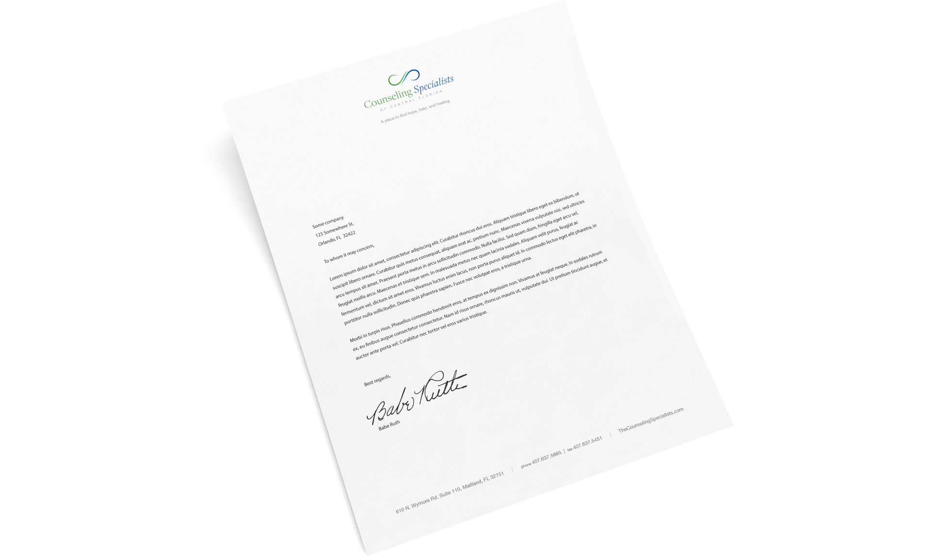
All the things! Well, maybe not all, but we still have to design business cards at the very least. Keeping with the new style, we incorporated the vibrant blue as the background on the logo side of the business cards. As Heidi & Ken are both very accomplished, the information side of their cards is nearly full. A slight design challenge, but one easily met with some simple text formatting. Their letterhead is traditionally quite simple, with the logo and slogan up top, and contact information at the bottom.
Where the new branding really shines is the custom designed website! We won’t say too much here as we’ve got another post all about that, but it is colorful and informational to say the least. Ken did a fantastic job filling it out with photos and text. We highly recommend you take a look.
Check out the website!
We’ve written some more about the website design and development. Click below to read about that or just jump straight over to their website.
Good people doing good things.
That’s what we believe in! Join the family and let us help you shine a little brighter like Ken & Heidi. It feels good – just call or click below and you’ll see!

